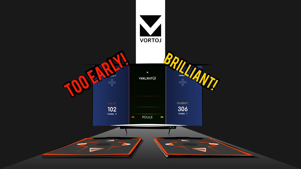
Redesigned main menu and new options in the main menu
Been working on a new design for the main menu so that it incorporates the language's flag. Had many an idea and although I started playing around with the idea of having a small flag, at last I settled on a blurred full screen flag in the background. Check it out!
Unified Music
Because the music in Vortoj the game is very important, I was very careful when picking the songs and absolutely fell in love with the works of a certain artist. I got in touch and he agreed on allowing me to use the very album that fit the game so well!Check him out he's a beast: 4bstr4ck3r
Apart from that this update comes with a myriad of small bugfixes, new features and newly added options let's take a look.
Bugfixes:
- Particle effects in the game weren't showing properly, they are now.
- Logo doesn't hide behind the options menu background anymore.
- Remapped "guess" sounds. When the player get the words Early! or Good! they are notified by a sound effect. These were lost in the dev process till now.
- Changing categories in options works as expected.
- Yes - No buttons finally got their half transparent idle textures
- Minor translations fixes
New features:
- Can't start the game if a custom category doesn't have enough many words. Minimum is 50.
- Players see their statistics at the end of the game. Including how many words they got right and wrong, and how many they missed as well as an overall percentage marking their overall performance.
- One can check the entire list of right/wrong words that was just played through. Allowing players to inspect the correct and incorrect versions. Educational. *wink*
- Play area has been redesigned from ground up. Bigger numbers, clearer words.
- Ground up redesigned of the main menu UI, with massive and blurred flags in the background.
- Credits + transitions and links
- Clicking a link to a website anywhere first triggers a pop up which checks whether the user REALLY wants to leave the game and visit the webpage. Was annoying accidentally clicking a link unwittingly and getting thrown out.
- In game Dancepad preview also has icons that show which direction is right, wrong and utter nonsense. Helps with getting used to the game at first. Can be turned off in options afterwards.
- Options menu has been fully refactored.
- General settings and music settings have been split into their own categories rather than being put together. Made sesne at the beginning when there weren't many settings at all. We're growing!
New options:
- Grey - allowing the user to choose the in game background to stay grey instead of a custom language colour.
- User data folder - a new button allowing the user to open the user data folder which holds the language categories and words files, useful for back ups! Super user friendly as this way they no longer need to search through they file system. Works on all OSs
- Strength of visual effects (0-1)
- In game UI transparency (0-1, zero being fully transparent).
- Users can change language to edit also in the options now, before they had to leave the options menu and change it in the main one. Much slicker now.
- All windows and UI areas have been tinkered with, refactored, resized and moved to line up properly.
Get Vortoj
Vortoj
Practice spelling of words in over 8 languages with dancepads. 2 player mode.
| Status | Released |
| Author | Lentsius |
| Genre | Educational |
| Tags | 2D, dance, dancepads, Singleplayer, Split Screen |

Leave a comment
Log in with itch.io to leave a comment.